22 January 2026 17:02
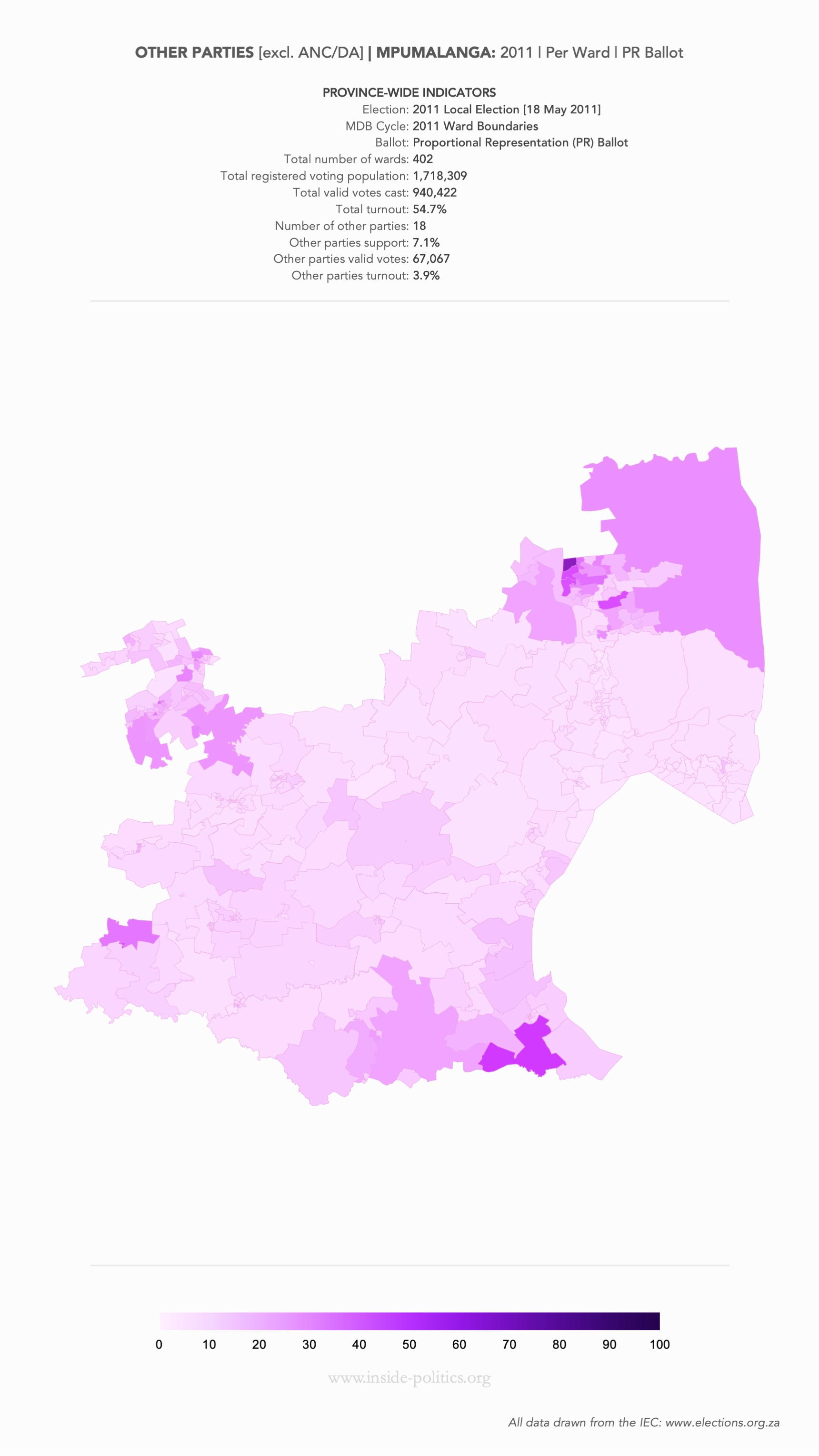
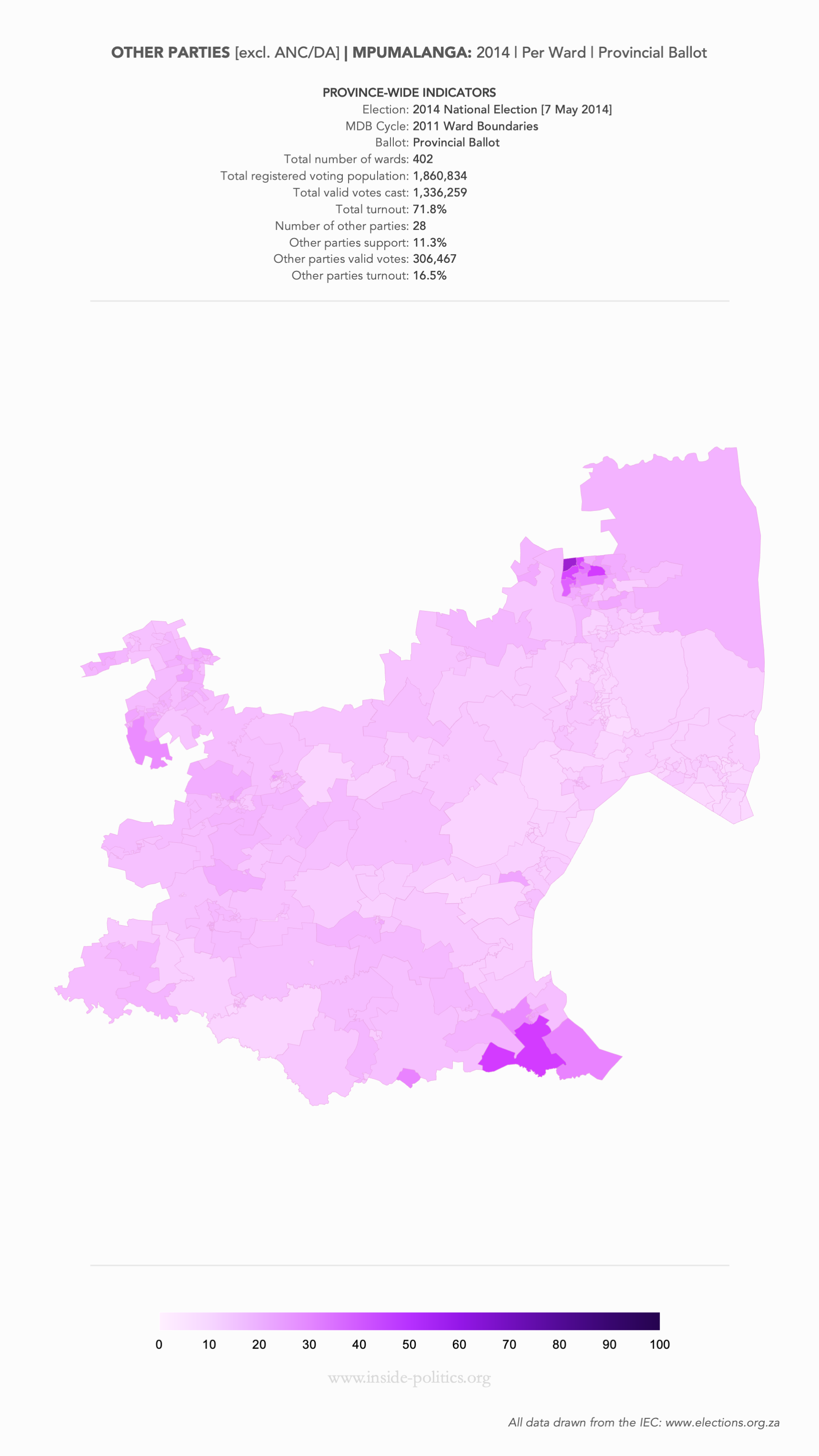
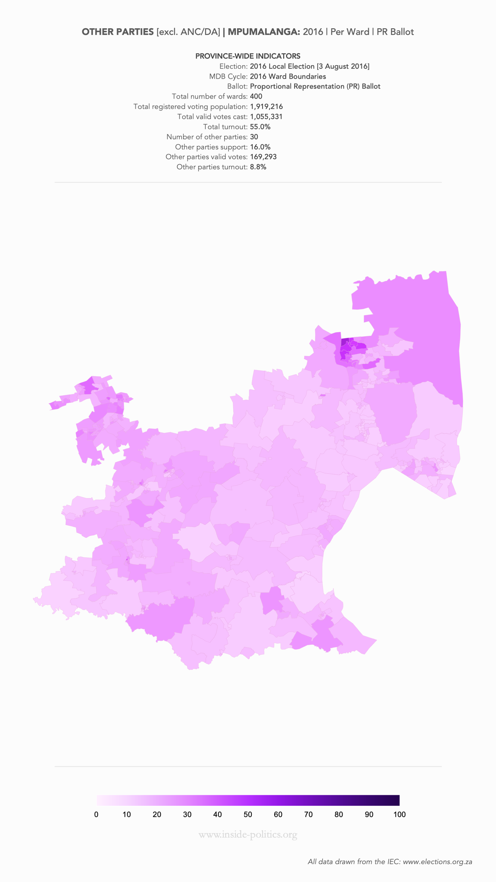
Election 2026/7 Resource: Heat Map | MPU | Other Parties [excl. ANC/DA] Support | By Ward
Explanation:
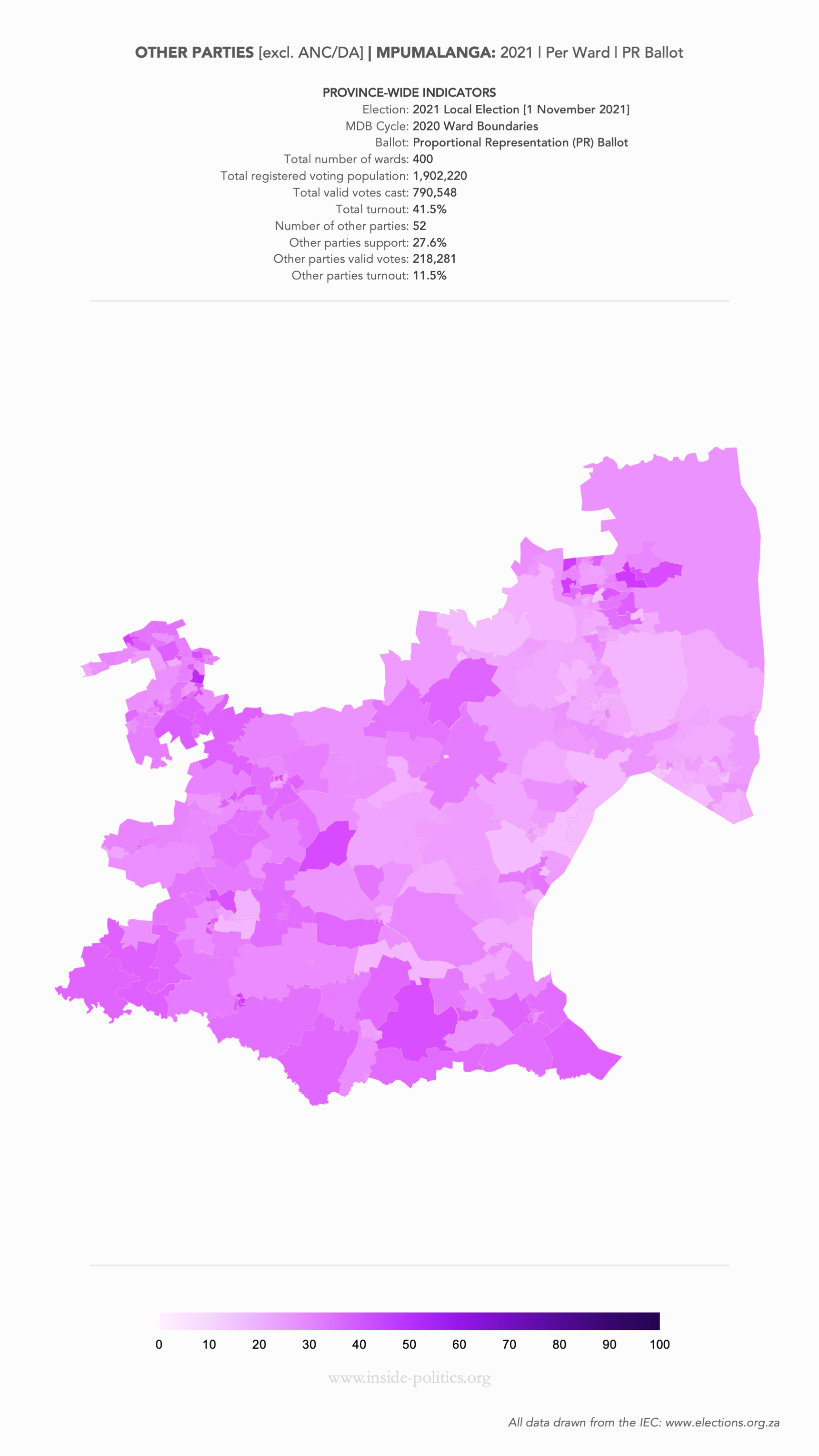
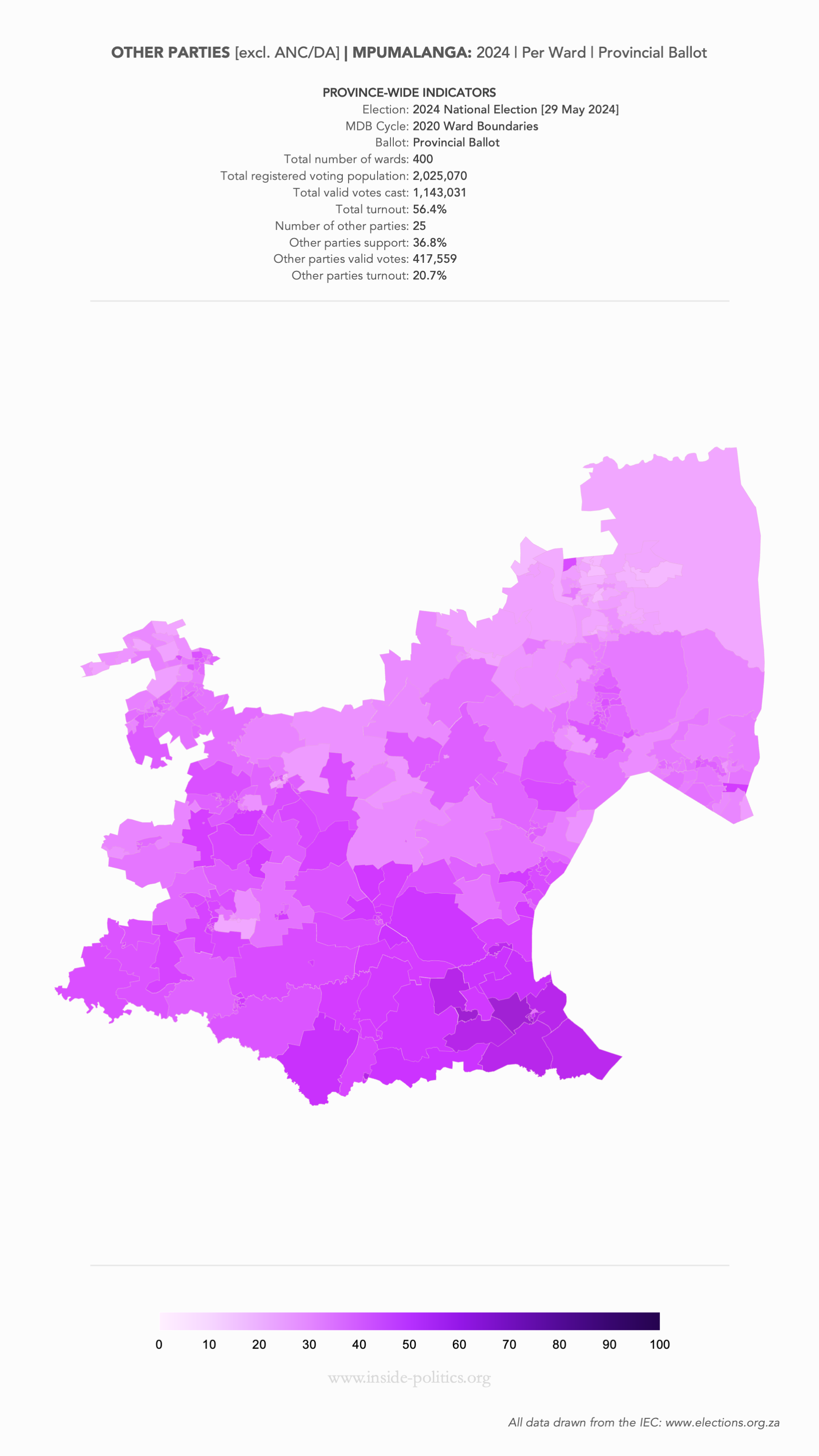
These are a set of what is commonly referred to as “Heat Maps”. The more technical name is Choropleth Maps. They are designed to use a colour scale, to demonstrate the intensity of one particular indicator – in this case: party support per ward: the darker the colour in a ward, the higher the support.
These are very difficult to build, for many reasons I won’t bore you with, but one of them is that ward boundaries change every election cycle (an election cycle is one local election, and one national election). So, although they look more or less the same, there is one map for 2011 and 2014, one for 2016 and 2019 and one for 2021 and 2024, and you may notice some subtle changes between those data sets.
Regardless, they are incredibly helpful for identifying:
Above each map, in a table at the top, is all the core statistical information relevant to that map.
Heat Map: Mpumalanga | 2011 | Other Parties Support by Ward
Heat Map: Mpumalanga | 2014 | Other Parties Support by Ward
Heat Map: Mpumalanga | 2016 | Other Parties Support by Ward
Heat Map: Mpumalanga | 2019 | Other Parties Support by Ward

Heat Map: Mpumalanga | 2021 | Other Parties Support by Ward
Heat Map: Mpumalanga | 2024 | Other Parties Support by Ward
Timelapse
Subscribe to get the latest posts sent to your email.
Posted by The Editor
Categories: 2026 Local Elections, Heat Maps, Resources, Statistics
Tags:
You must be logged in to post a comment.
Mobile Site | Full Site
Get a free blog at WordPress.com Theme: WordPress Mobile Edition by Alex King.