
Election 2026/7 Resource: ANC-DA Ward Trade-Offs | CTM
by The Editor
Election 2026/7 Resource: ANC-DA Trade-Offs | Cape Town | By Ward
Explanation:
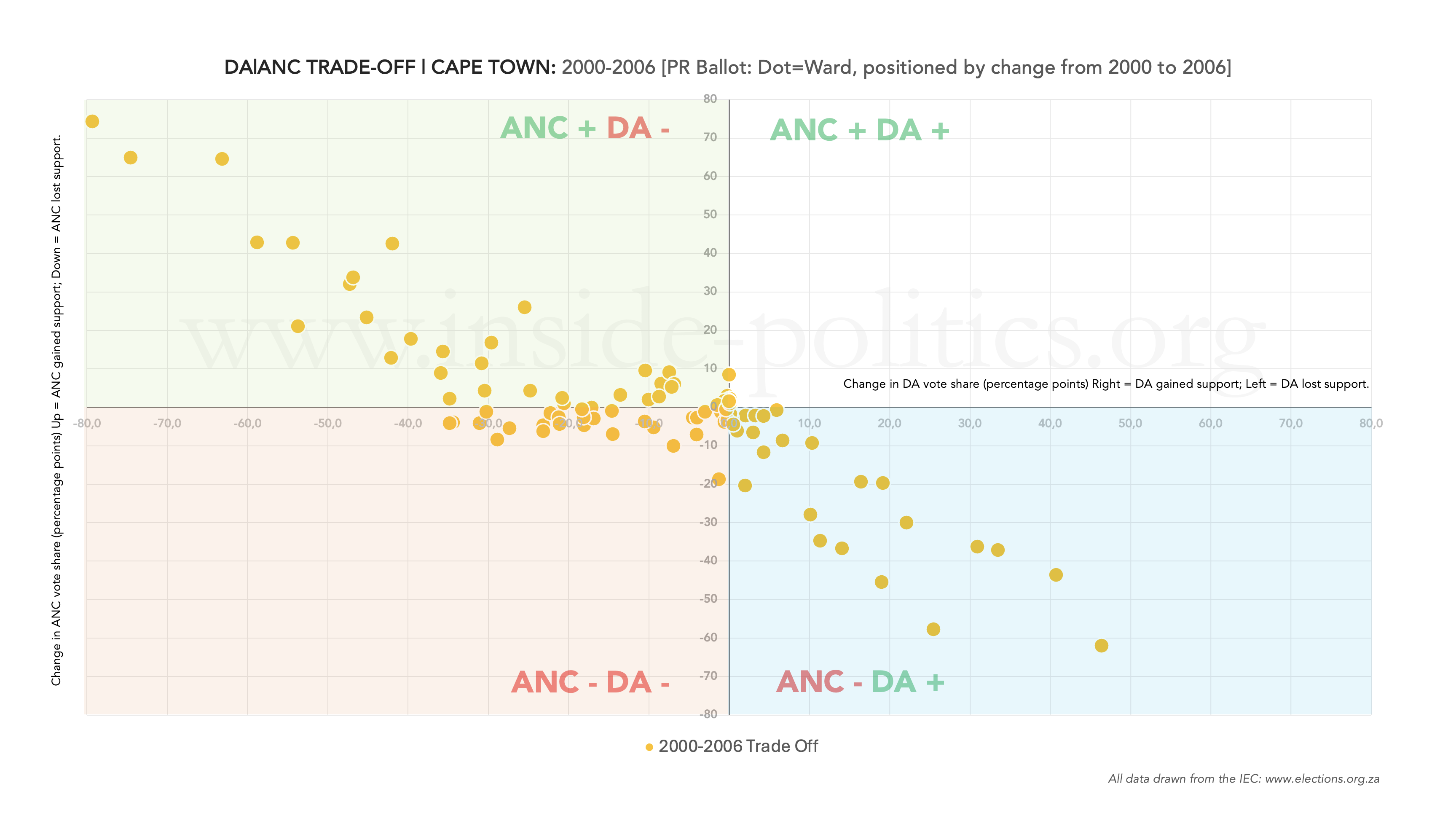
These are called “trade-off” graphs. They plot the relationship between the ANC and DA vote. If ANC votes go up, do DA votes go down, and vice versa?
Because wards change, we can’t run this analysis for all election years (you need consistent wards between elections to see the change). The years 2006-2011 are problematic across the country in this regard (with the exception of Cape Town), as the ward boundaries changed. But for all other scenarios (2000-2006, 2011-2016 and 2016-2021) we can generate trade-off graphs. In the headline of each graph, you will see the number of wards that are being directly compared.
So, every ward is a dot on the grid represents a shift in support. If the ANC did well in the ward, the dot moves up. If the DA did well, the dot moves to the right. In this way, we can split the chart into four quadrants:
- Q1 (top left): ANC up, DA down
- Q2 (top right): ANC up, DA up
- Q3 (bottom left): ANC down, DA down
- Q4 (bottom right): ANC down, DA up
Thus, from the ANC’s perspective, a good election is when a large number of dots are in Q1 (ANC up, DA down). From the DA’s perspective, a good election is when a large number of dots are in Q4 (ANC down, DA up). And from both parties’ perspective, the place you don’t want to be is Q3 (ANC down, DA down).
ANC-DA Trade-Off: Cape Town | By Ward [100 comparable wards] | 2006 [from 2000]
ANC-DA Trade-Off: Cape Town | By Ward [105 comparable wards] | 2011 [from 2006]

ANC-DA Trade-Off: Cape Town | By Ward [111 comparable wards] | 2016 [from 2011]

ANC-DA Trade-Off: Cape Town | By Ward [116 comparable wards] | 2021 [from 2016]

Discover more from inside politics
Subscribe to get the latest posts sent to your email.

You must be logged in to post a comment.