
Election 2026/7 Resource: Heat Map | CTM | All Maps
by The Editor
Election 2026/7 Resource: Heat Maps | CTM | All Maps
Explanation:
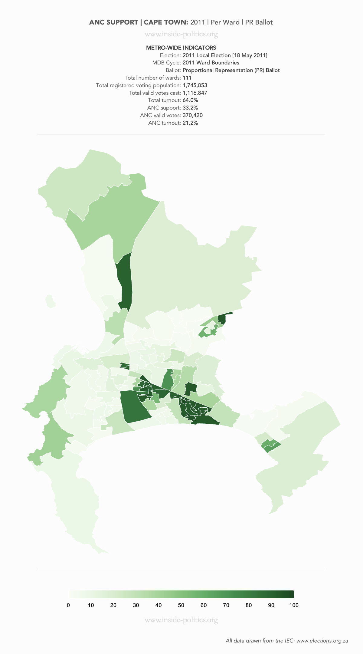
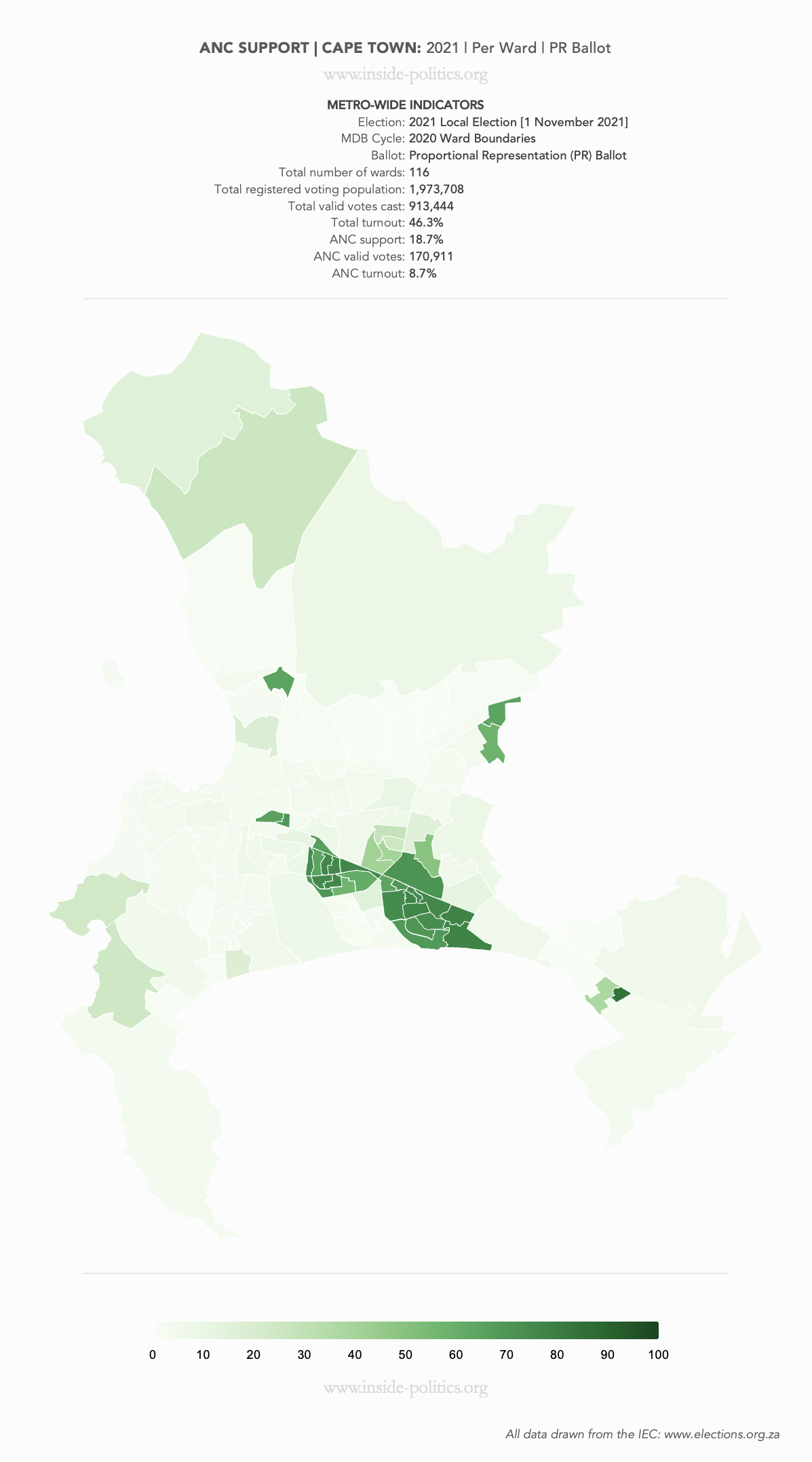
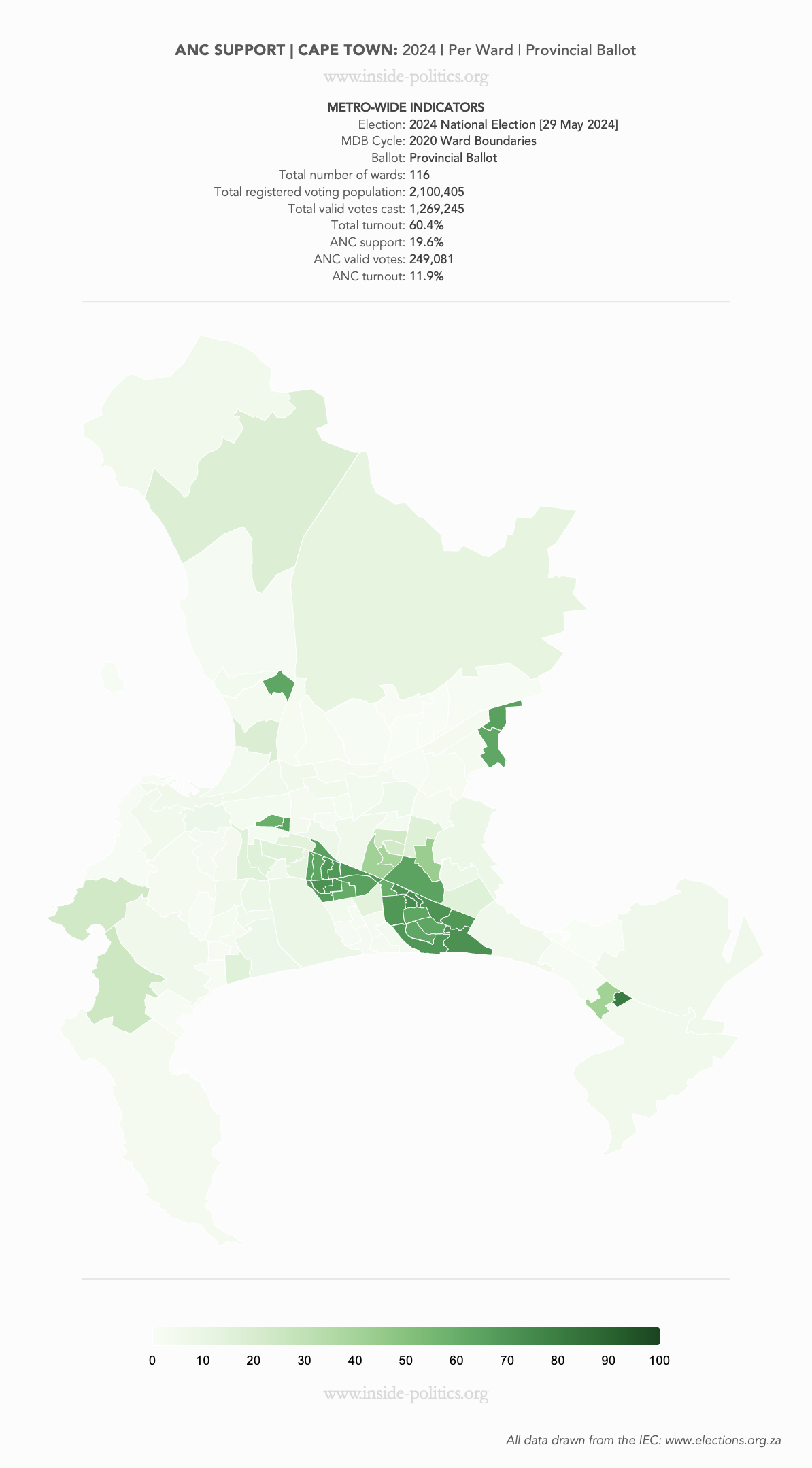
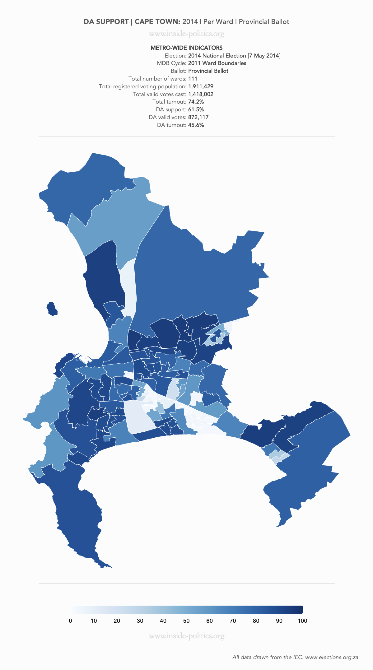
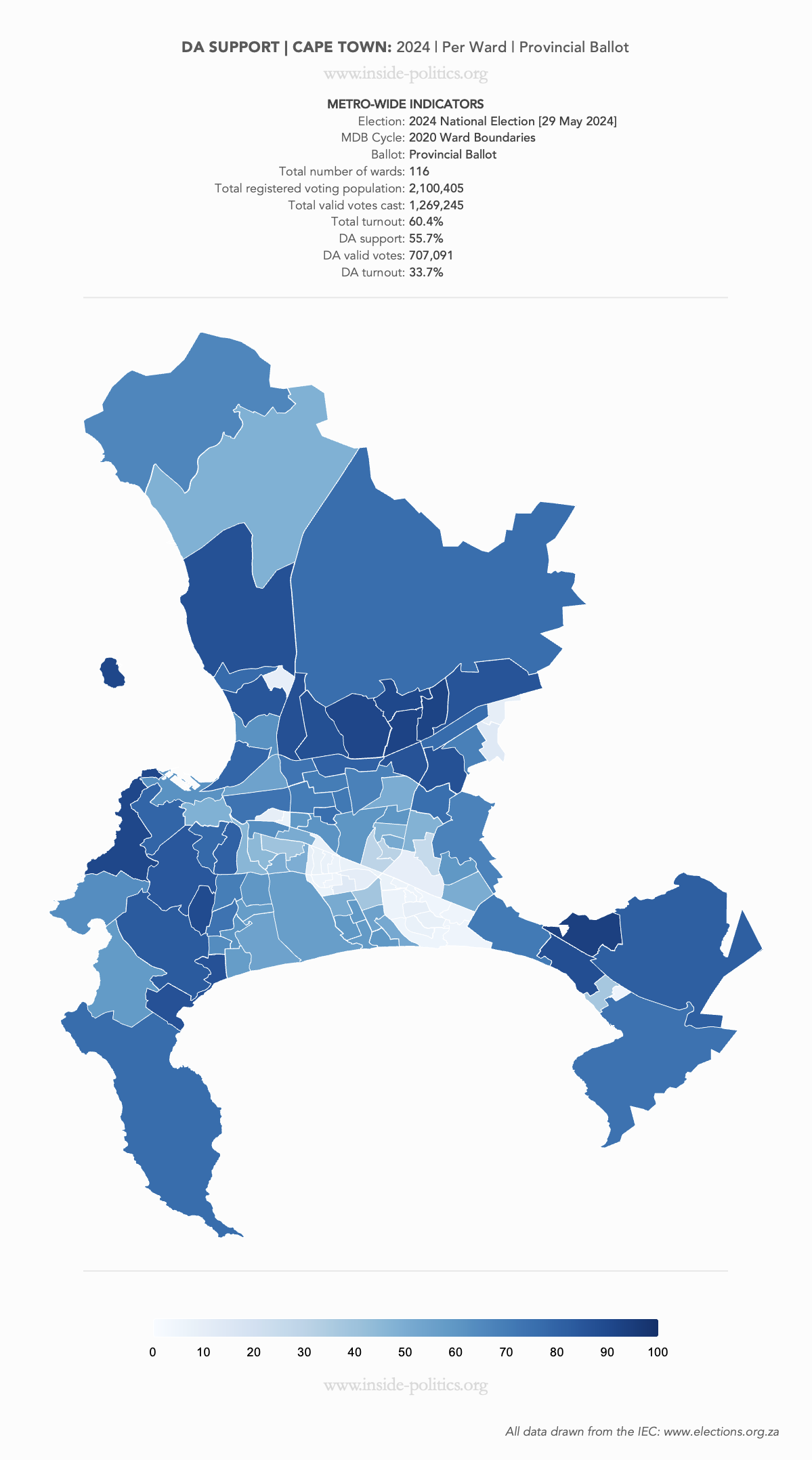
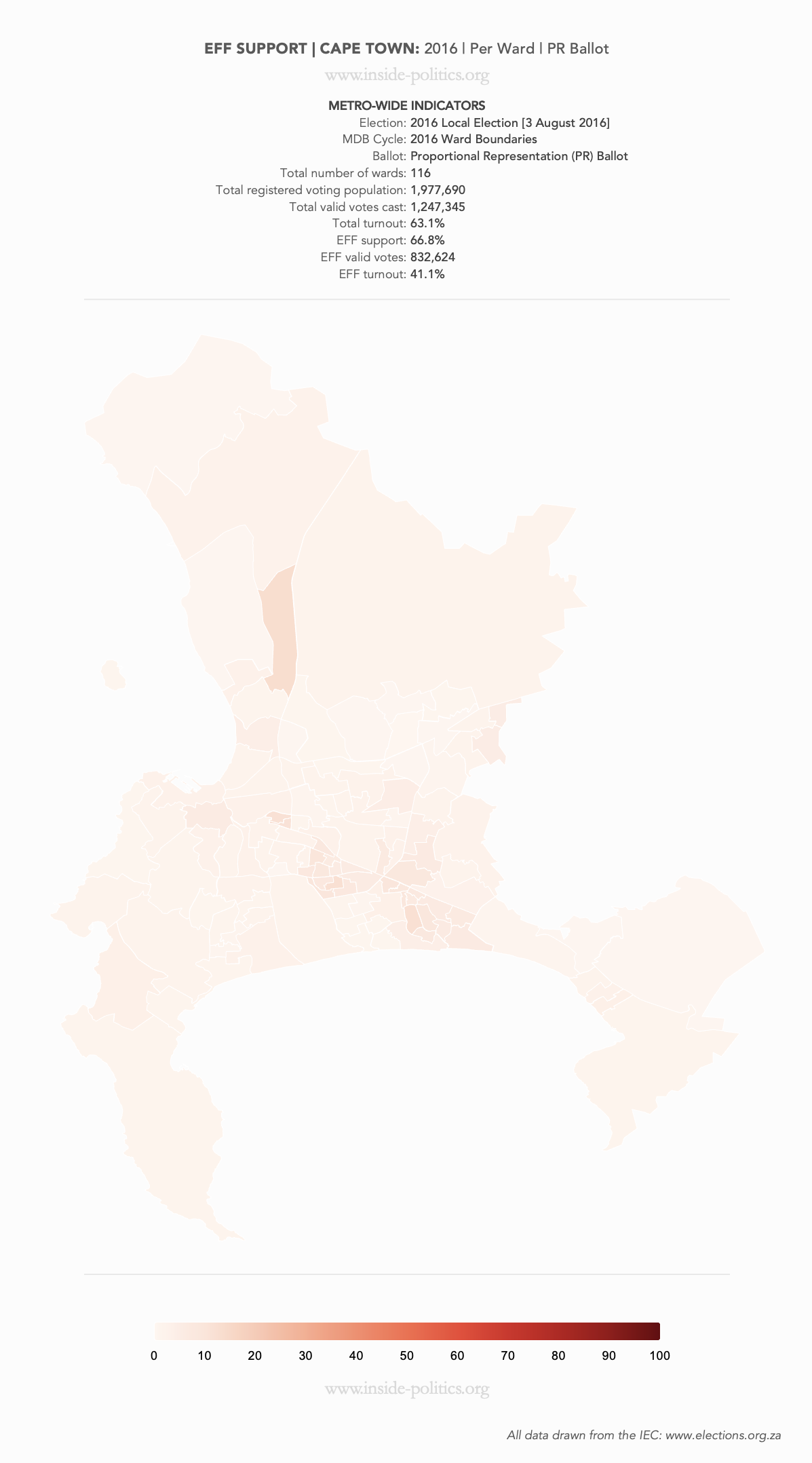
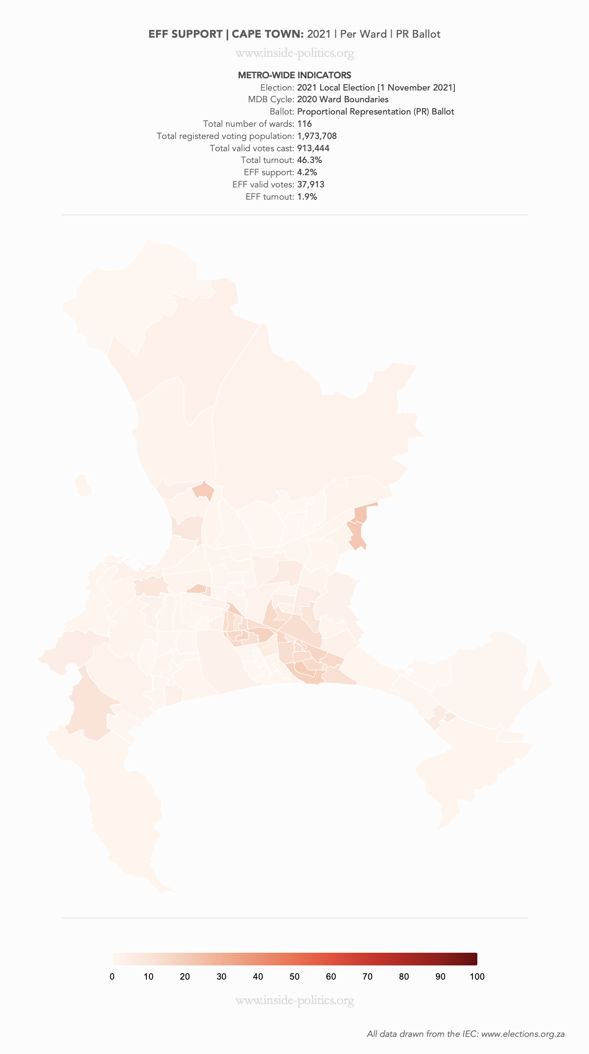
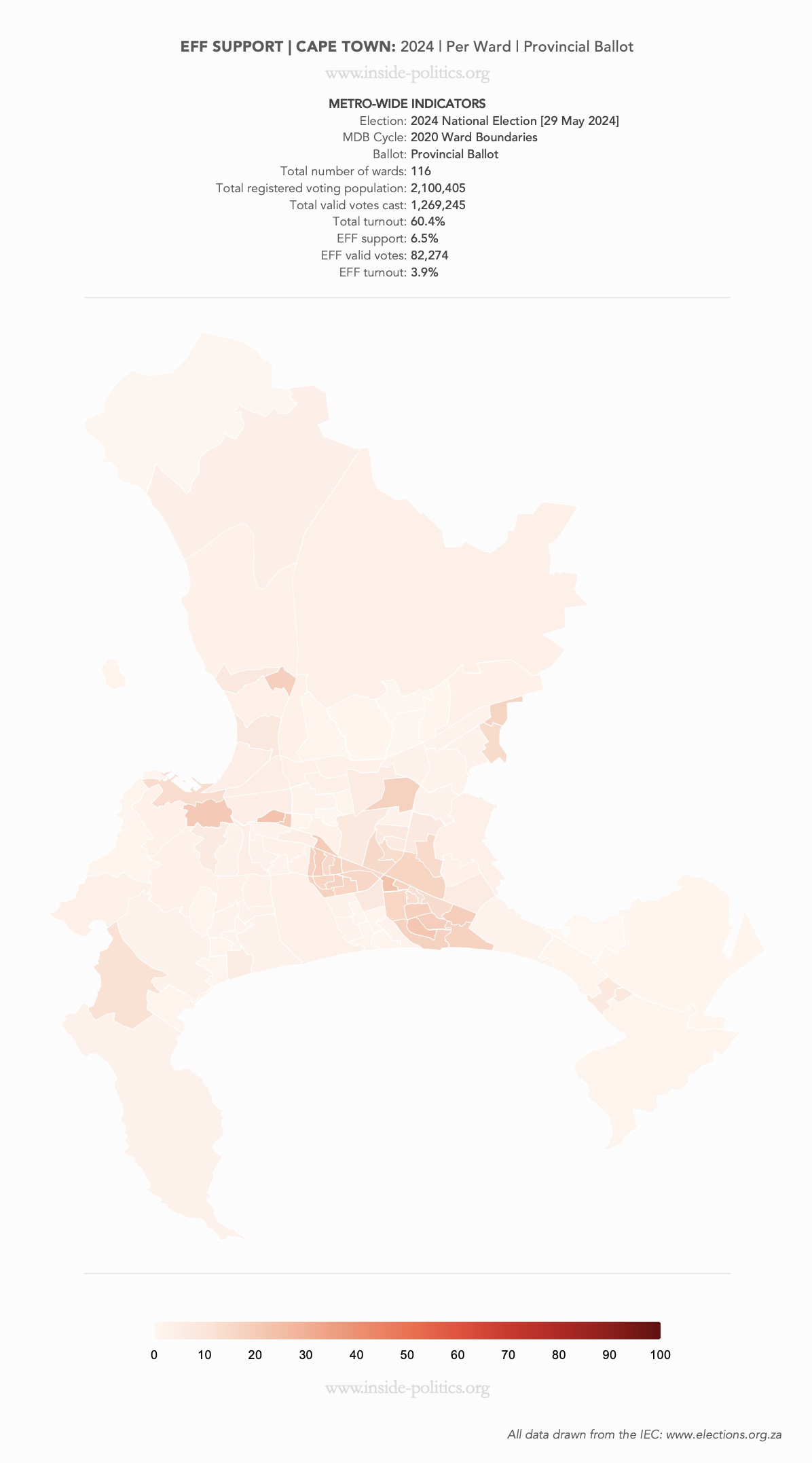
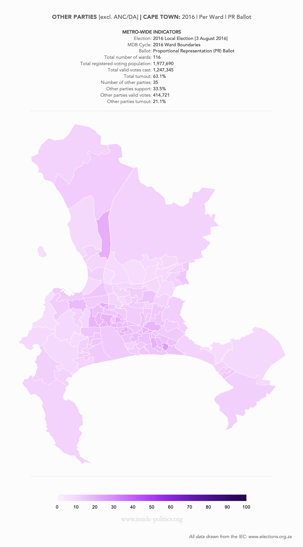
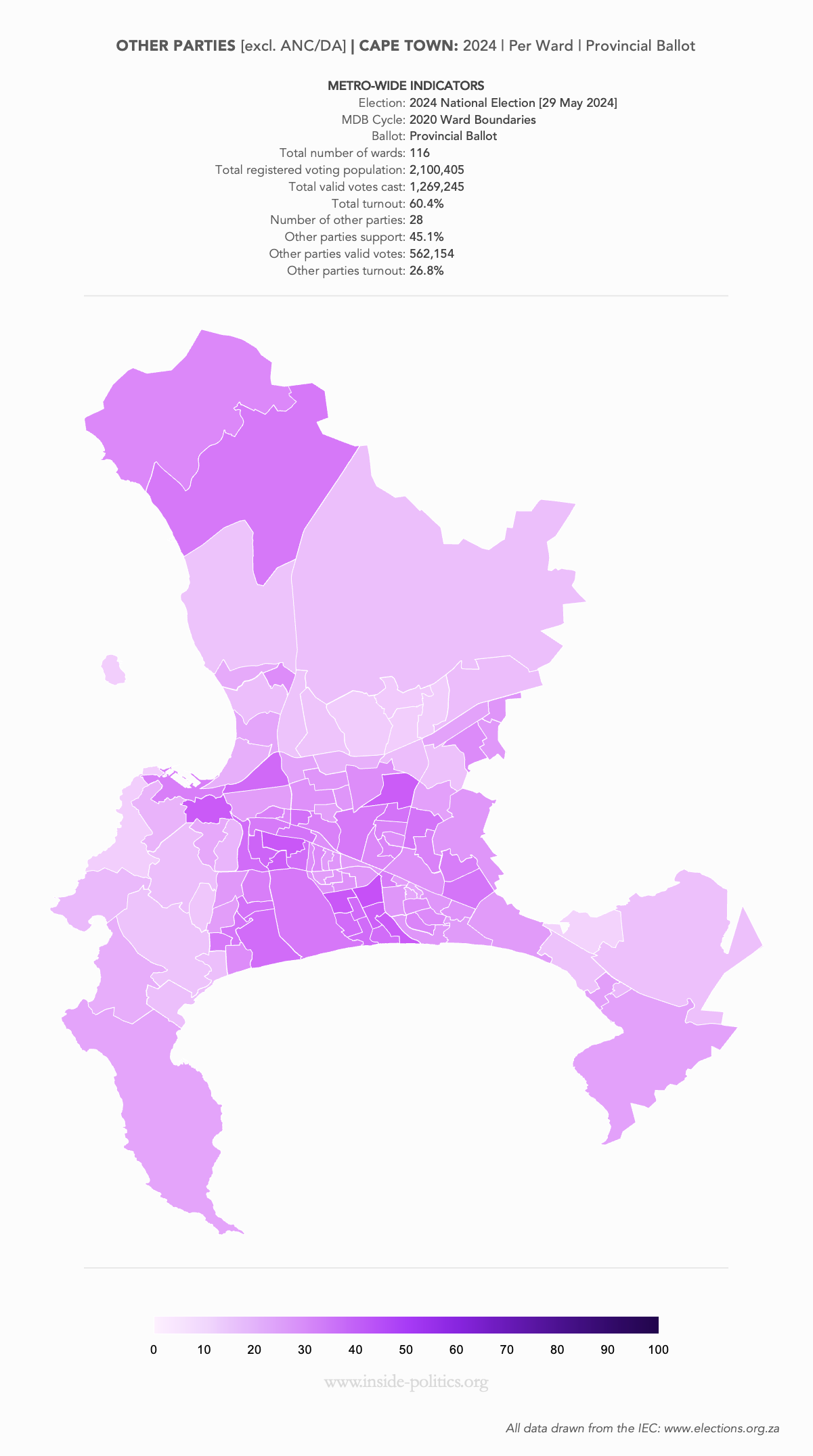
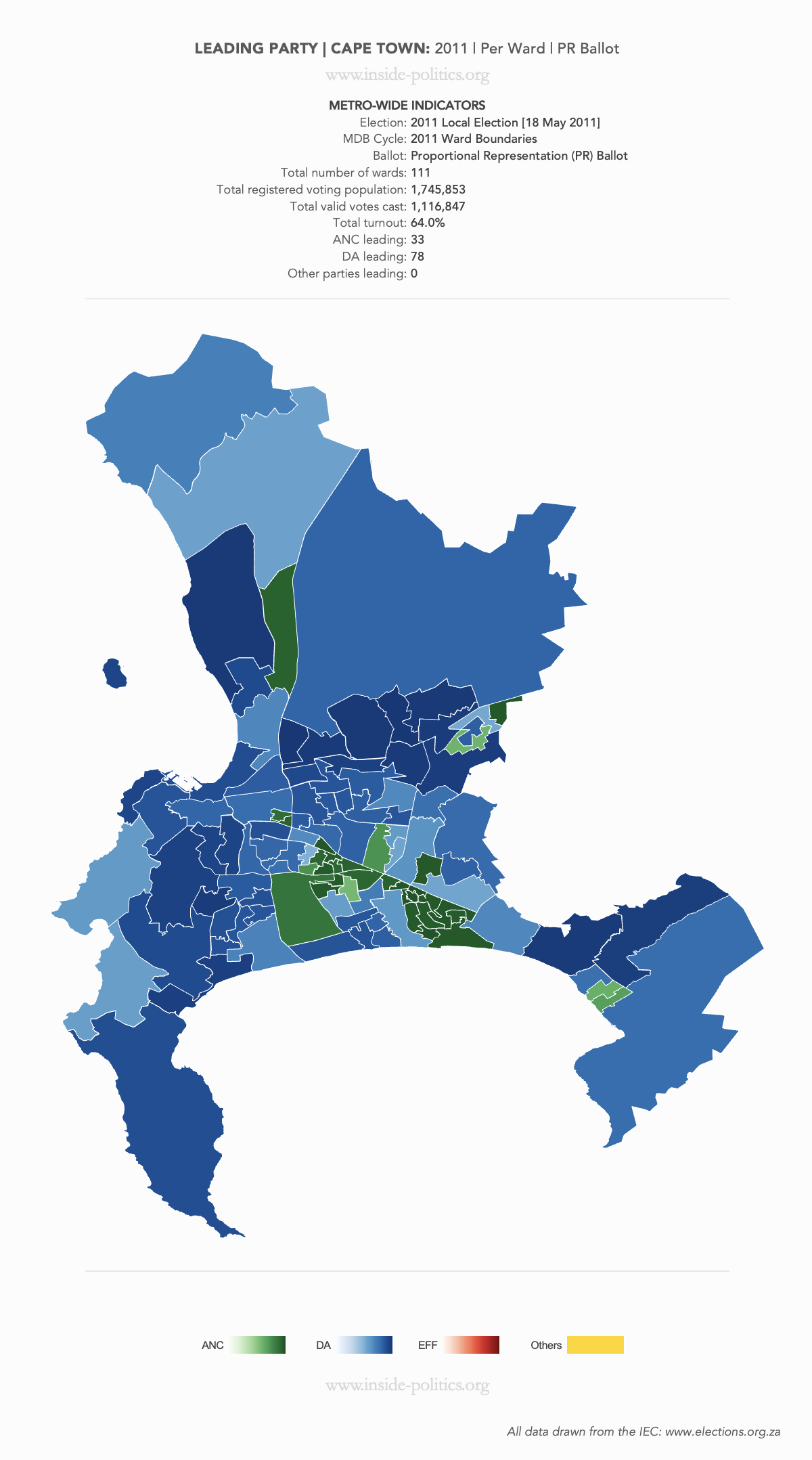
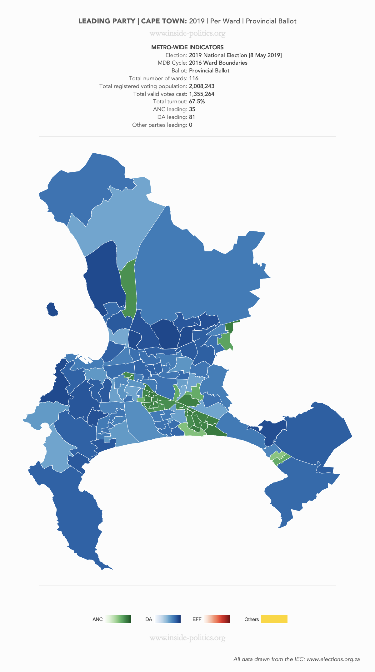
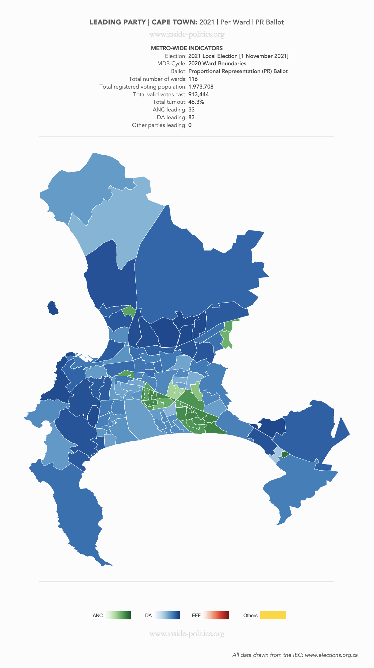
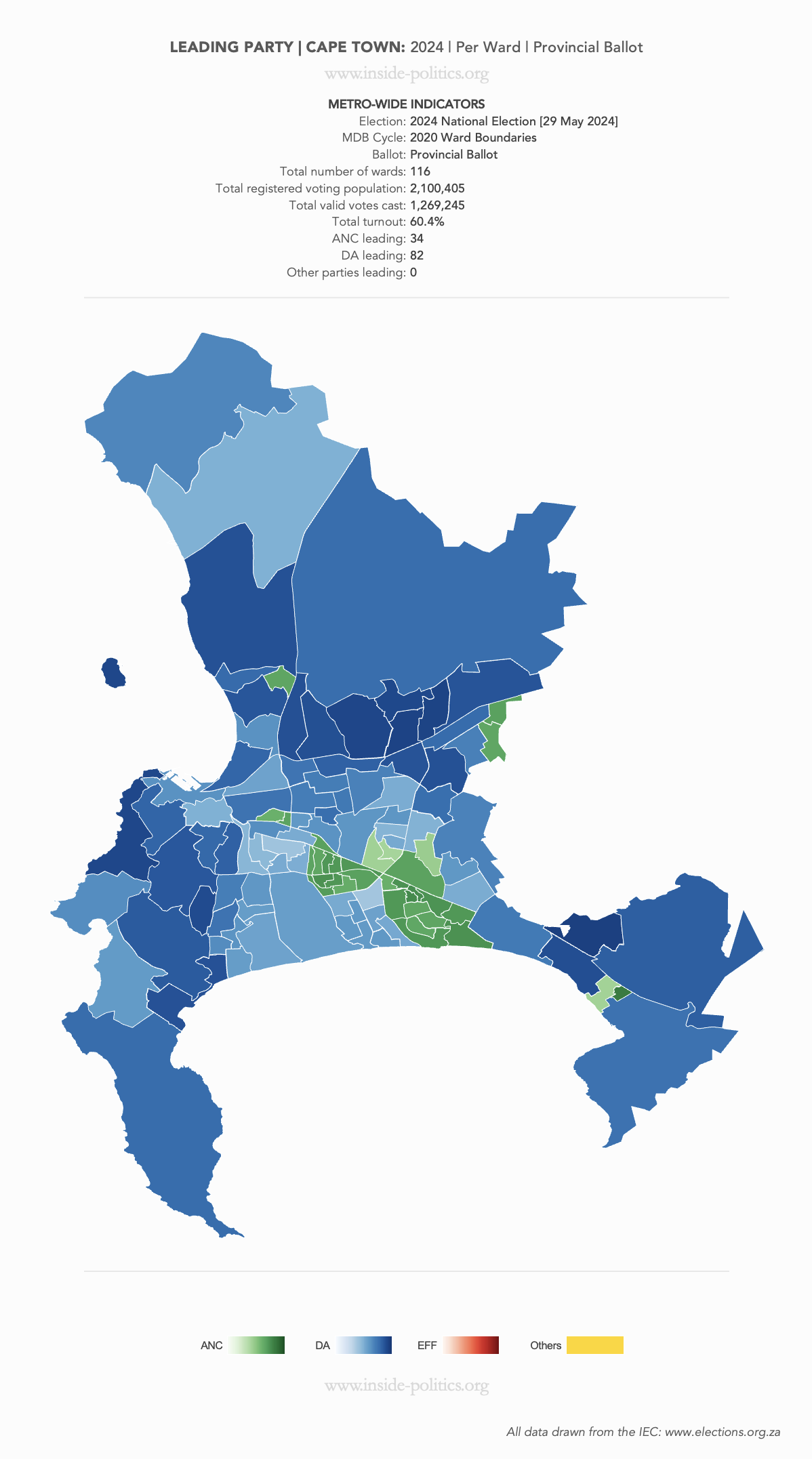
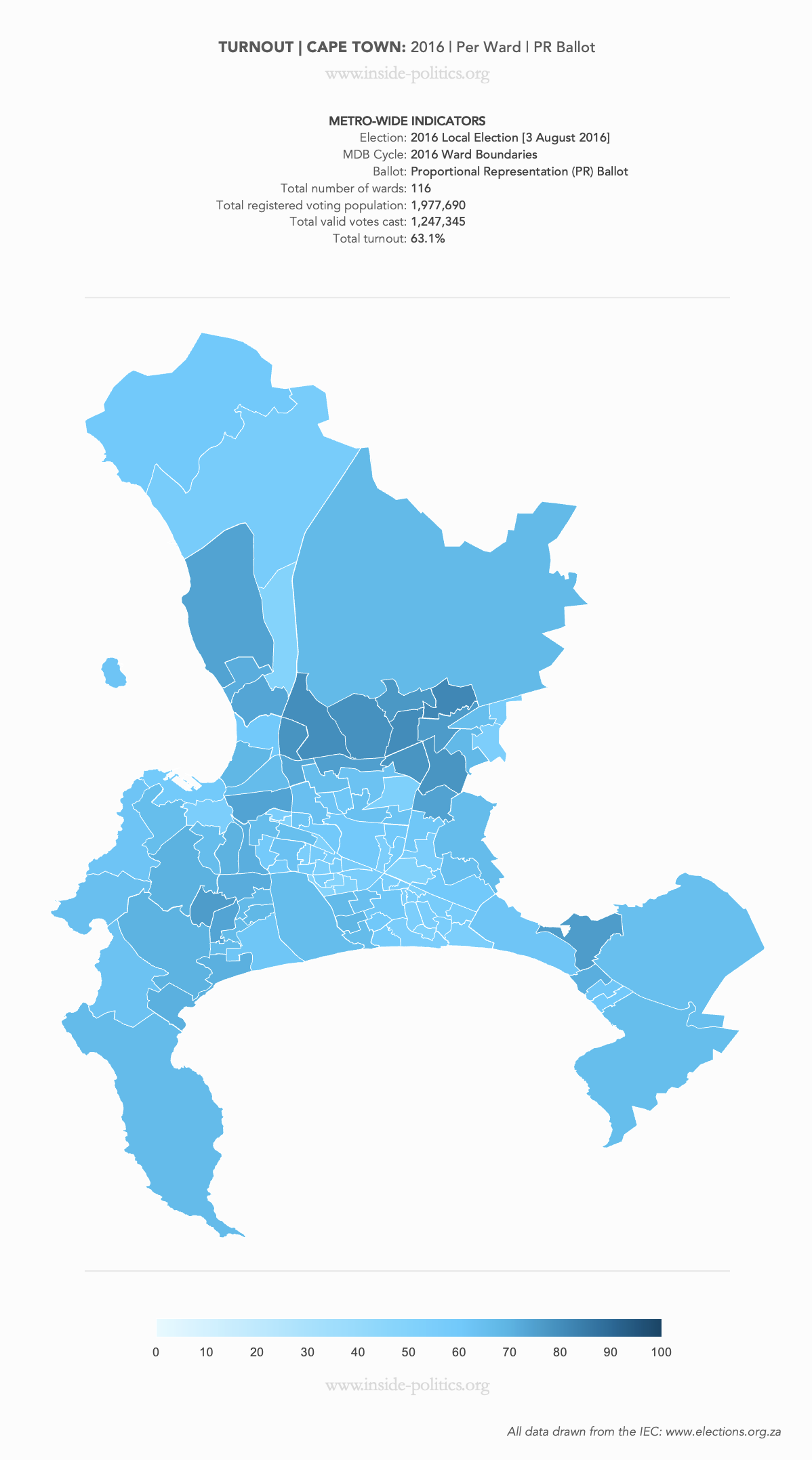
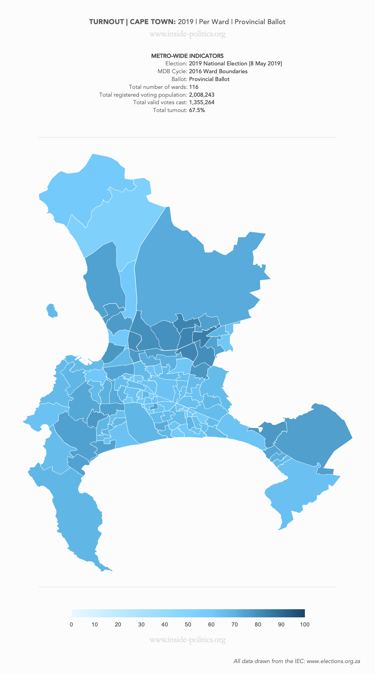
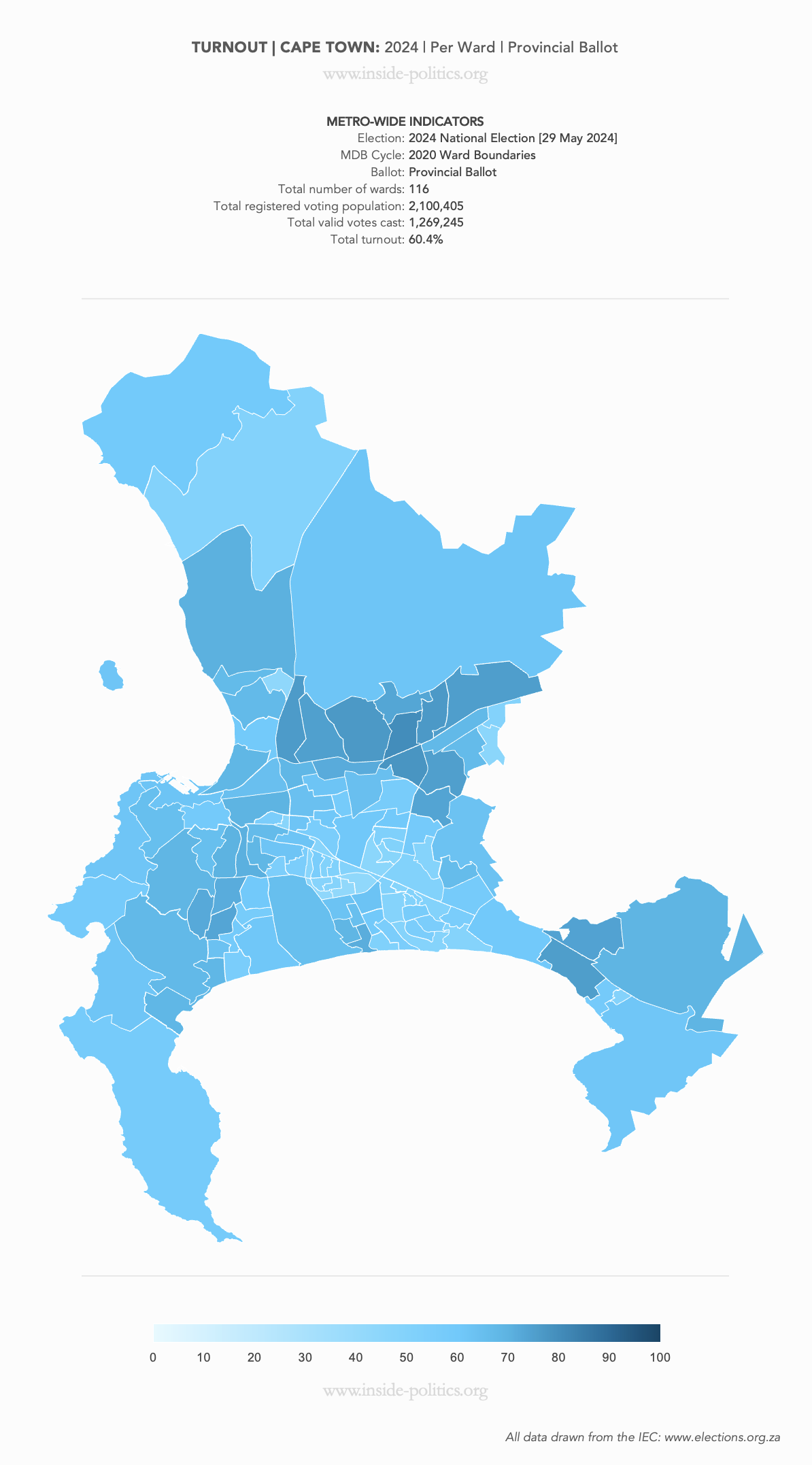
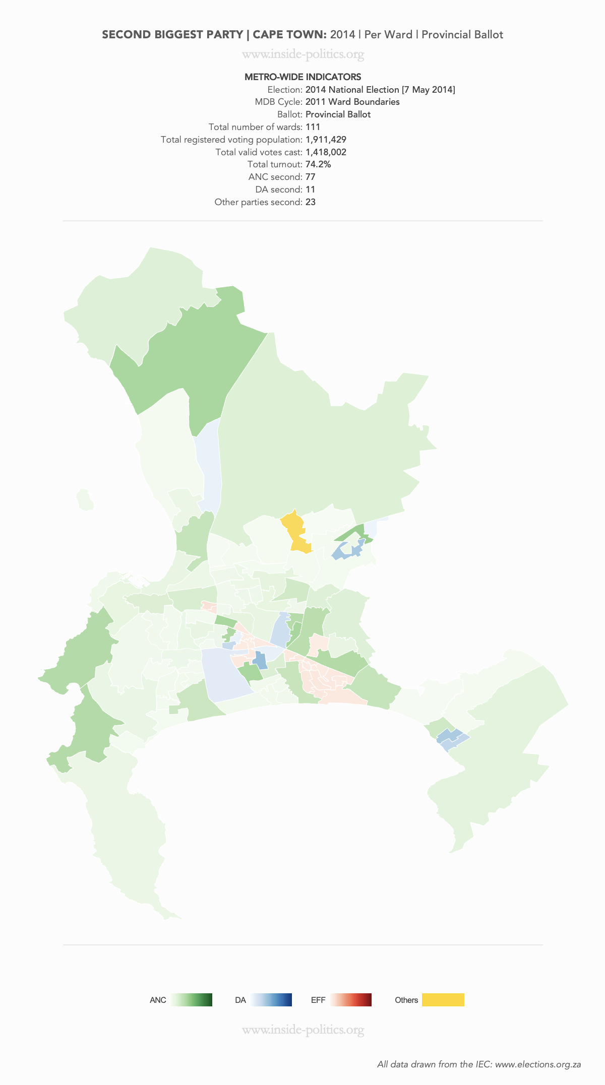
These are a set of what is commonly referred to as “Heat Maps”. The more technical name is Choropleth Maps. They are designed to use a colour scale, to demonstrate the intensity of one particular indicator – for example: party support per ward: the darker the colour in a ward, the higher the support. However, any indicator – turnout, registered voters, losses and gains, almost anything – can be mapped this way.
These are very difficult to build, for many reasons I won’t bore you with, but one of them is that ward boundaries change every election cycle (an election cycle is one local election, and one national election). So, although they look more or less the same, there is one map for 2011 and 2014, one for 2016 and 2019 and one for 2021 and 2024, and you may notice some subtle changes between those data sets.
These are a consolidated set of all maps for Buffalo City. It will be updated as more maps are added. Each map can be clicked on, and enlarged, for closer inspection. Each set of maps also has their own entry, on the Resources page.
Above each map, in a table at the top, is all the core statistical information relevant to that map.
Heat Maps: Cape Town | 2011-2024


Discover more from inside politics
Subscribe to get the latest posts sent to your email.

You must be logged in to post a comment.