
Election 2026/7 [14] Developing a turnout track, using Johannesburg
by The Editor

Here I explain what a turnout track is and how it works, with a view to producing a range of these graphs for the Resources Page. Their most powerful insight is comparative, allowing us to see a turnout differential between two parties.
Developing a turnout track, using Johannesburg
By: Gareth van Onselen
Follow @GvanOnselen
7 February 2026
This essay is the 14th in an on-going series on Election 2026/7, for all other editions of this series, please click here: Election 2026/7
Introduction
I am going to be adding a new set of indicators to the Resources Page: turnout tracks. I will do these nationally, for each province and metro, and I am going to use this page to explain how they work.
We will use Johannesburg as an illustration, and the ANC and DA as the parties we will focus on. In 2021, the ANC got 33.22% and the DA 25.45% on the PR ballot. We can break those performances down into performance percentage points, grouped by wards in a more systematic fashion.
In other words, using the DA, we could plot how many wards the DA got 1% or more in, how many wards it got 2% or more in, 3% or more in, 4% or more in, and so on. Up to 100%. Naturally, the number of wards for each percentage point will drop to zero as you approach 100%, as no party has ever achieved 100% in a ward in JHB.
Once we have all the relevant groups of wards for each performance percentage point, we can work out the DA’s turnout (the number of valid DA votes in that group, divided by the total registered population of that group), and put a dot on a graph.
If we run turnout percentage (0-100) on the vertical axis, and performance percentage points (also 0-100) on the horizontal axis, when we have a dot for every performance percentage point we can join them up and see the turnout track – a line that shows us the relationship between the percentage of registered voters that voted DA by how well the DA did in those wards.
Here is what it looks like for JHB in 2021:
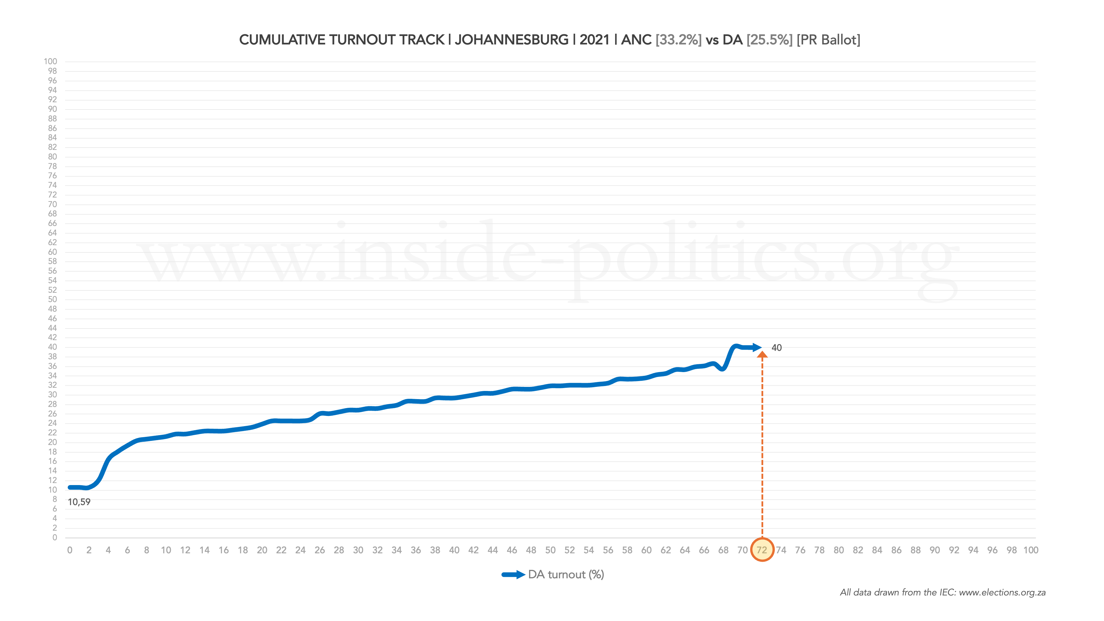
So, what can we tell from that? Well, for one, we can immediately see that the DA’s highest performing ward in JHB in 2021 delivered 72% (ward 72, as it so happens) – the point where the turnout track line stops. As the DA did not secure any vote share in any ward higher than that, there can be no more DA ward groups beyond that dot, and the line stops there. At that point, the DA track’s zenith, 40% of all registered voters in that ward, voted DA.
I haven’t included labels for every dot or the graph would be become too cluttered; regardless, they don’t really matter, it is trends we are interested in. I will just be using a label for the very first and very last dot.
[One note here, the very first label is the party’s overall turnout average, as it represents all wards.]
There is, however, important context missing. The number of wards that correlate with each performance percentage point. They are hidden. But we can make them appear, we just need to use a secondary axis on the right (1-135, the number of JHB wards in 2021). Here is what that looks like:
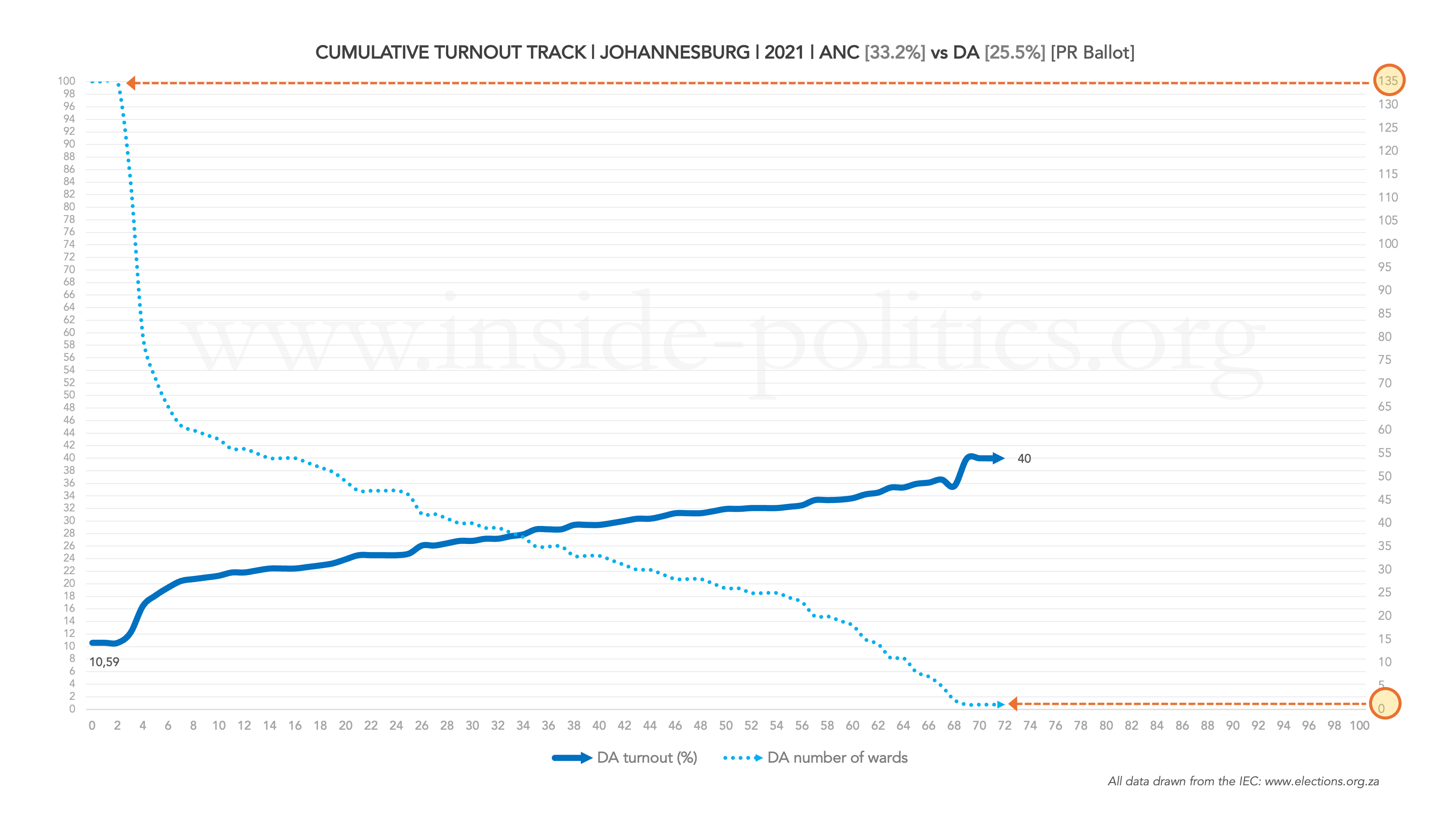
Now we have both primary indicators, and it becomes far easier to understand what we are looking at. DA turnout grows the better it does; but, as it does better, so the number of wards in which it performs well drops. That final dot (72%) represents just one ward. But 10.59% (the DA’s starting point on the graph) represents all 135 wards (which makes sense, the DA did better than 0% in every single JHB ward). That’s why the first label is also always the party’s average turnout among all registered voters.
There is one final core indicator we need though, to make complete sense of this graph: the overall average turnout for that election (the official turnout figure for all parties), against which we can compare the DA’s turnout level. In those wards where the DA’s turnout line breaches the overall election turnout percentage line, the DA is really excelling: its voters alone are turning out in greater numbers than the average across the whole metro.
Here is what that looks like:
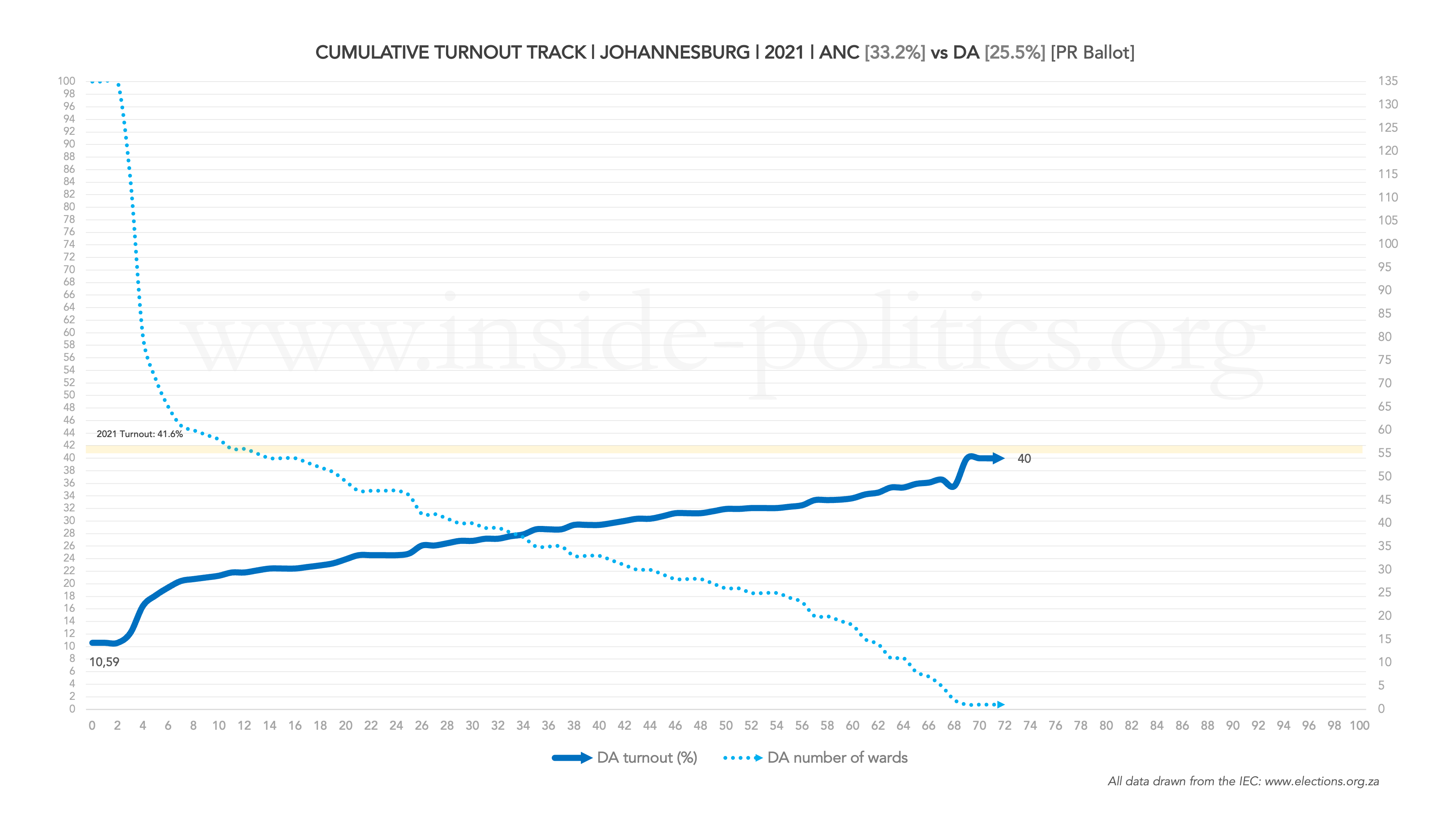
The DA failed to breach the average turnout line in 2021, a sign of depressed turnout across the board.
You might argue this all makes good sense but is not generally that helpful. This stuff is fairly obvious. You would be right. The true value of these graphs is comparative. Let us go back to one line – the DA’s turnout track – but include the ANC’s turnout track on the same graph:
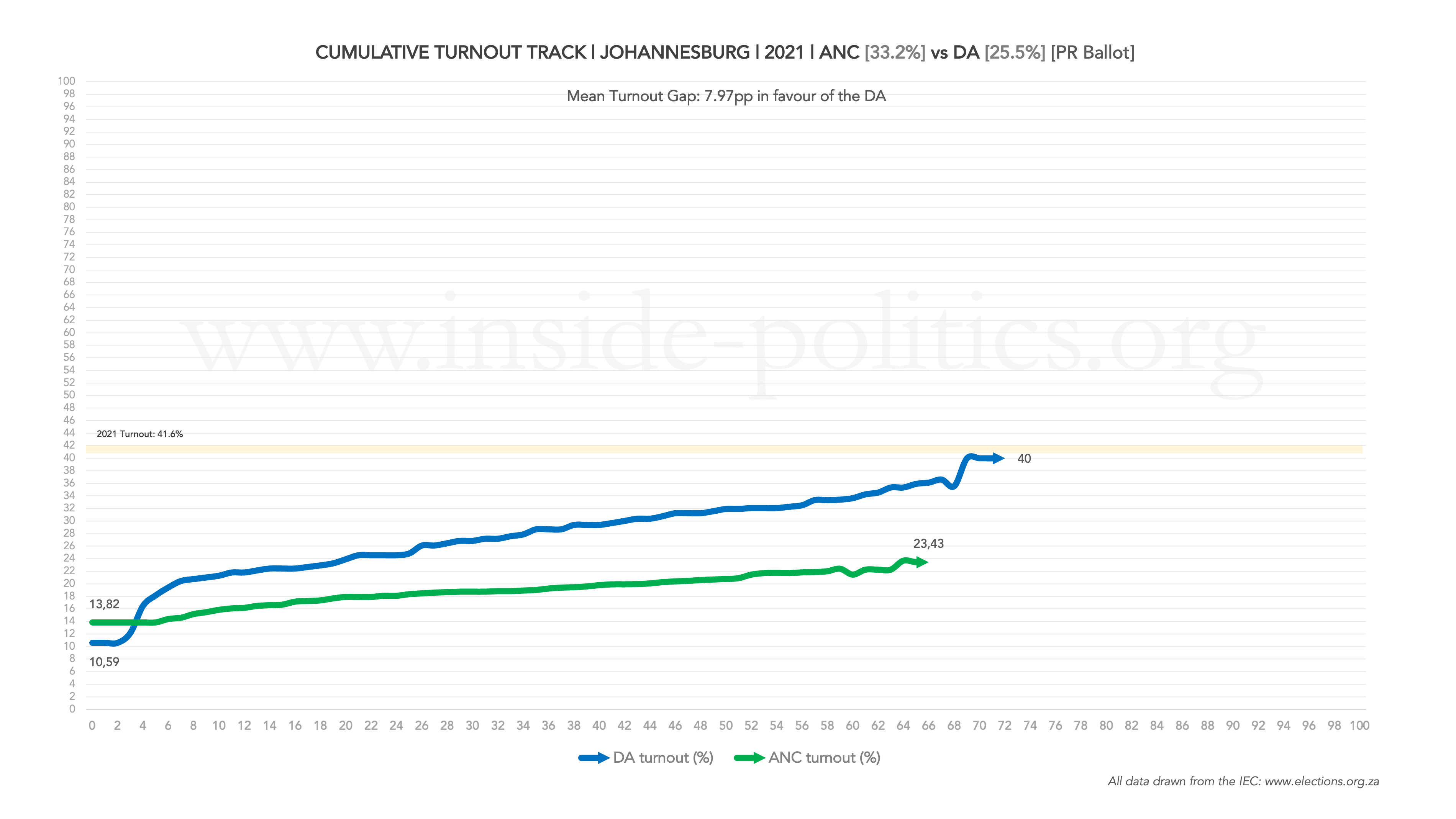
Now we have something very interesting. What you are looking at is a turnout differential, and you can immediately see why the DA does so well in local government elections. From around the 3rd performance percentage point onwards, it dominates the ANC and, as its support grows, so the gap between the two widens. At the top of the graph, you can now read the size of the average gap between the two lines: 7.97 percentage points in the DA’s favour. That is a significant advantage.
Not only that, but the DA’s line runs deeper than the ANC’s. The ANC’s track stops at the 66 performance percentage point mark. The DA’s track runs to 72. So, how can the DA outperform the ANC? After all, it finished behind the ANC in terms of percentage support? Let’s add the ward numbers in for each party:
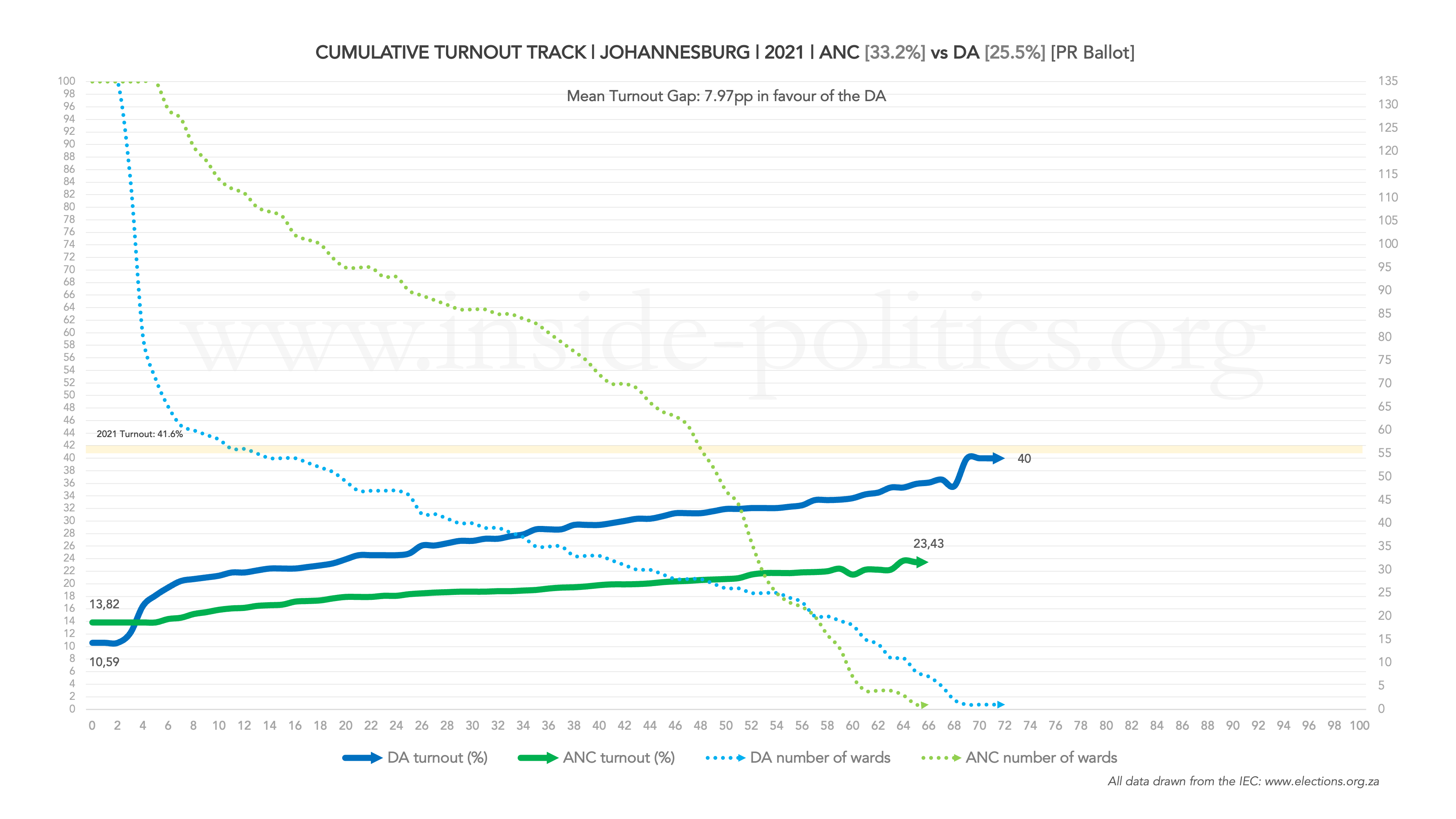
Now we can see that ANC turnout is flat, but the respective number of wards per dot is broad: it might have a lower differential turnout, but it makes up for it in absolute numbers, as each performance percentage dot generally comprises a far greater number of wards than the DA. And that, despite the DA’s performance, is how the ANC ended on 33.2% and the DA on 25.5%.
Another important insight, to be drawn from this graph, regards the gap between the two lines. Let’s call it an “Advantage Window”. Here it is, highlighted:
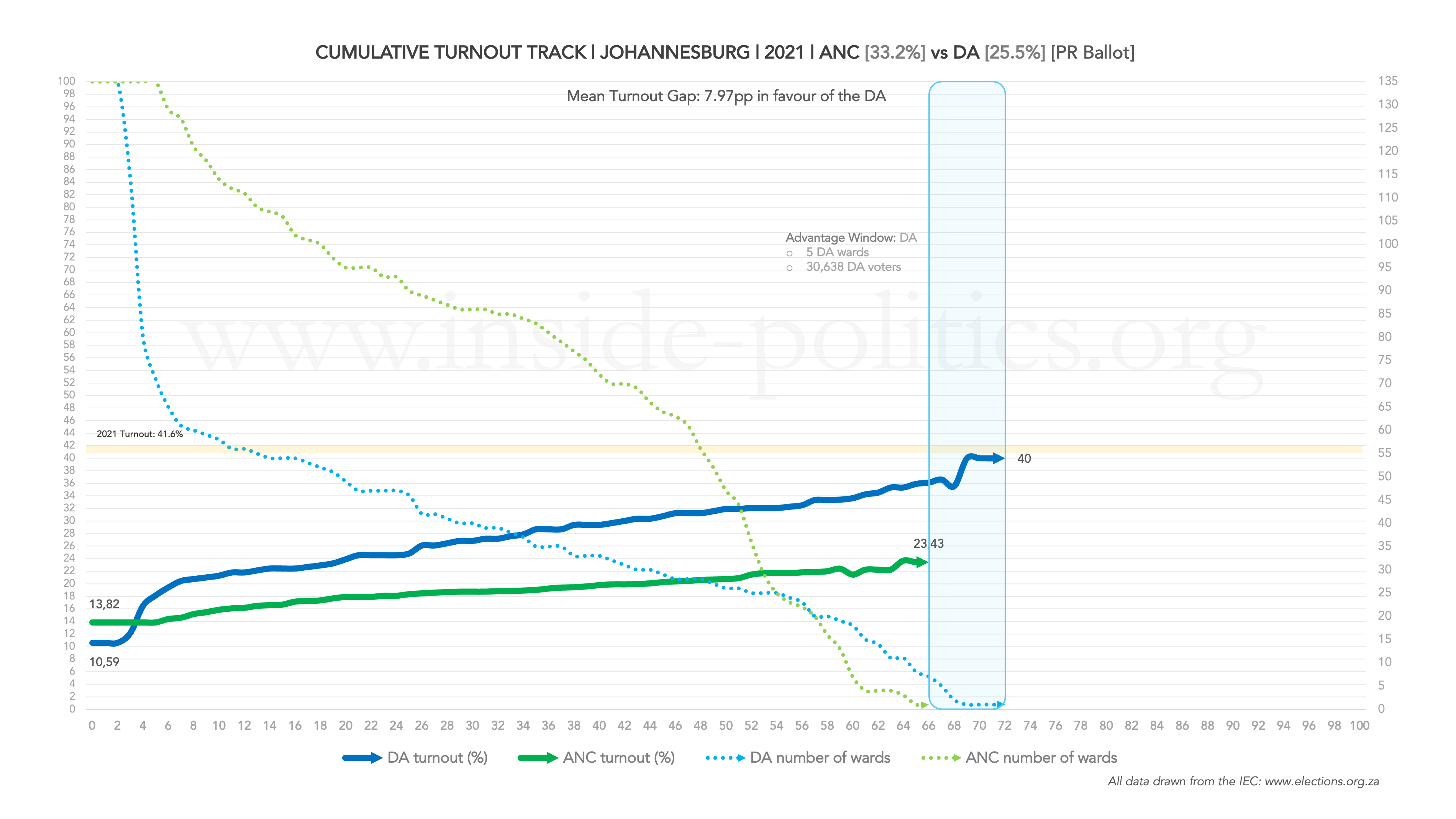
The Advantage Window measures which party continues to mobilise voters further into the extreme end of its support base.
It illustrates the extent to which a party’s biggest strongholds sustain high voter turnout beyond the point at which the other party’s turnout curve ends. Thus, it is a measure of reach rather than intensity.
In the graph above the DA thus beats the ANC in two regards: 1. Its turnout line is higher 2. The Advantage Window is also in its favour, so its reach was deeper than the ANC. High turnout and deep reach is the best combination a party can have. The more wards and voters are packed into the Window, the deeper that party’s reach.
In the graph above, the DA only has five ward in the Window, comprising just over 30,000 DA voters. So it is only a small advantage. But you will see with other graphs, this Window can contain as many as 50 wards in some metros, and 250,000 party voters (typical of the ANC in earlier LGEs, 2000 and 2006, before its reach started being decimated).
It is possible for one party to have a higher turnout line, while still having no Advantage Window, if its turnout curve terminates earlier than the other. Imagine, above, the ANC’s line ran longer than the DA’s, but still below it. In that case, the Window would illustrates that the ANC has lower turnout, but more reach. Together with its ward distribution, a sign of broader as opposed to concentrated support (compared to the DA).
2021 has a broader context, however. Overall, turnout fell through the floor (it was 41.6% on the PR ballot, compared to 56% in 2016). The previous LGE, 2016, was by contrast the highest turnout has ever been in a JHB LGE, so it makes for a good point of comparison for the same set of indicators. Here is what those look like:
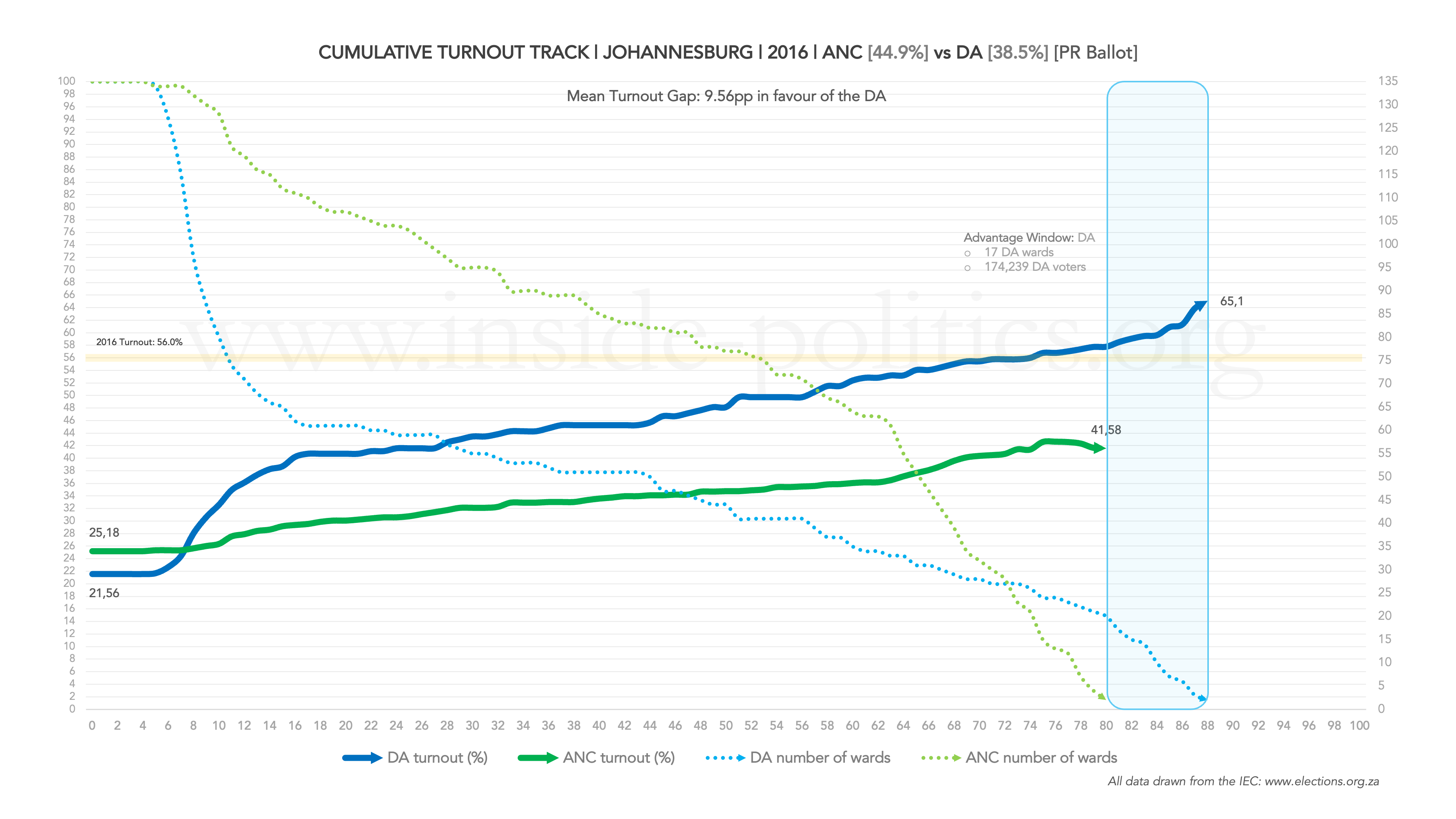
Some profound differences between those two graphs. Higher turnout across the board in 2016, meant both parties’ tracks started higher up (ANC at 25% turnout, compared to 14%; DA at 21% compared to 10%), and thus both lines run higher. The DA even breaches the average turnout line. The ANC is again flatter and its ward count broader, but the DA’s ward line in 2016 doesn’t drop anywhere near as steeply as it does in 2021, meaning many more wards are covered per performance percentage point.
Perhaps as big a difference is the Advantage Window. The DA runs longer than the ANC again (the first time it had ever done that), as well as longer than its own performance in 2021, but in that window are now 17 wards comprising 174,000 DA voters, compared to five wards in 2021. That is a huge number, enough to drive the DA up to an all-time high of 38.5%.
There is much more that can be done with these types of graphs. Each of them have something to offer. I will try fit as much as I can into the coming graphs. I will start uploading the metros this week and work on finishing everything from there over the coming month. When they come, I hope the above is enough to make sense of them.
This essay is the 14th in an on-going series on Election 2026/7, for all other editions of this series, please click here: Election 2026/7
Discover more from inside politics
Subscribe to get the latest posts sent to your email.

Good thinking well illustrated! Thanks.